Designing fun into my site
Aug 9, 2023
Written by Ian Lasky
I wanted to take a bit of time to chat about the design of Resgen, which is something that I wanted to make bold from the onset. I'll give a peek into the design of certain elements and my thought process behind them.
As someone who primarily codes, design wasn't something I was well-practiced in. However, I definitely knew I had my own particular taste and I wanted to express that in my work.
So, without further ado, let's dive into it!
Guiding philosophy and inspiration
When building things, I strive to make them simple. Rich Hickey had a great talk about the difference between simple and easy and what they mean for software.
Regarding Resgen, I aimed to have things be clear immediately. For example:
The end result should, hopefully, be more intuitive, accessible, and simple to use without any surprises (except for those I build in).
The inspiration for the design came when I started to notice some sites with big bold layouts that were unapologetic for being so bold. I discovered that the term for this sort of design is neobrutalism and I loved it. Is it a fad? Maybe. But I loved it anyways.
Tools I use
This site is build in SvelteKit and styled with TailwindCSS. I personally believe that Svelte and Tailwind are a combination that cannot be beat in terms of speed to "getting the thing to work". We'll take a look at one of the components a little later so you can see what I mean.
More than a splash of color
The most important aspect when designing the site was color — the thing needed to pop. I wanted it to look like the place was fun to be. Let's face it, job hunting sucks, so I figured the least I could do was make it a bit more colorful, you know?
So, I went and started experimenting with colors. I quite like the color RGB(34 211 238) and so I decided to start with that as the main color to root the site.
The next thing was to determine what colors look good behind that button. If I had the button on a similar background, of course that'd be wacky, even if it was a different lightness. For example, here's the button with a darker background.
It just feels off. So, the background colors need to bring out contrast in each other. Let's try it again with an orange:
Ahhh feels a lot better. It may not be 100% it, but it is definitely closer.
The variety of colors on the site are another aspect I wanted to explore. There are basically infinite colors at our disposal - why not just use as many as possible and see what works? Lean into the clash.
Each of the colors give a clear visual cue that "hey, you've entered a new section of the page". Each section should have a different character, otherwise the content, despite actually having different words, starts to feel the same as the rest of the page.
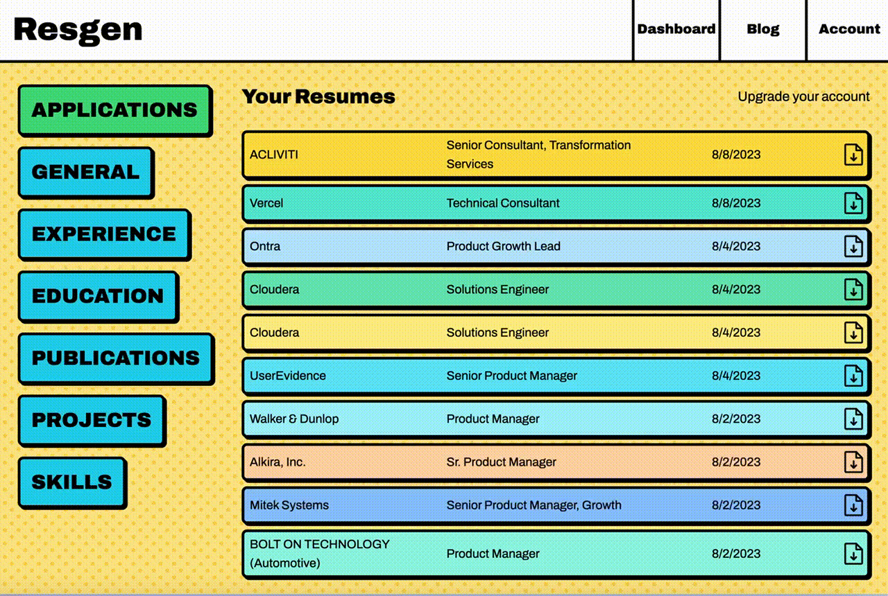
The last thing regarding color is I wanted the dashboard to feel new each time you came to the page. So, I randomly generate the color of certain aspects each time you visit to help keep it feeling new, but familiar. For example, when you navigate to the dashboard, you're first greeted by your list of previous applications. Each time you visit this page, the color of each item in this list changes. Check it out:
Make elements feel more tangible
It's easier to show what I mean to start, rather than explain it. So, let's take two buttons.
When we click the left button, yes it scales down to show we clicked it, but is feels rather "flat", right? It isn't a very satisfying thing to press that button.
The right button, however, compresses the shadow into the button, making it feel like there is depth to the press, similar to pressing a button in real life. You can almost hear the "click" as you press it.
The next aspect I added to make the feel of the site more tangible is to add textures to the background, textures like lines and dots and waves, like below:
These backgrounds, almost like wallpaper in a home, provide something more than a flat color for things to be on top of. In the same way you see a rug and know that it is going to be soft just by looking at it, you can look at a background texture and see one is more inviting, softer on the eyes, and breaks up the monotony of an otherwise dull page. The only exception I've found is text-heavy pages (like this one) because after staring at the screen for long enough it can become irritating to the eyes.
I like to move it move it
Products with tasteful movements added to them put them over the top for me. Not just software, but any kind of product (even a toaster from the 50s).
The first thing I actually built was the logo movement. I always felt that the logo was underutilized in other sites, so I added just a little zhuzh that makes it give a "huh, neat" response when the mouse hovers over.
Resgen
If you came to this blog directly from the link you may have missed it, but if you navigate back to the blog page, the list of blogs have a transition effect added to them. Specifically, it uses Svelte's fly transition. Each element has a little bit of a delay from the previous, making the successive appearance effect.
The most extensive movements are when you enter the dashboard and the applications fold down (shown in the gif in the section about color), or if you navigate to one of the input sections and the colorful buttons appear in succession. These movements give me the feeling that the software wants to be used and is interactive. If I am presented without that, there is a slight calculation of what is clickable and what isn't.
Conclusion and the future
As with most things, Resgen is an ever-changing thing that will be redesigned and tweaked over time. I want to add things like reduced movement and colorblind accessibility options so everyone can use Resgen without discomfort. If you have some suggestions on this front, I'd love to hear them!
Overall, I hope that this post helps others try their hand at designing. I am certainly learning as I go, but I wanted to share some of the things I learned along the way. It's a colorful world out there and we shouldn't be afraid of using it, adding some whimsy to our products, and really just having fun with it.
P.S. if you are applying to jobs and want some help generating resumes for each job, feel free to check Resgen out!